


Laika
Last night I presented at the data visualization meetup at Twitter HQs. It was really awesome to meet the people there and nerd-out about visualization related things.
You can find the slids for my presentation here. Also the video is here:
The presentation was mostly about the process of releasing public-facing data visualizations at Twitter, and also some analysis on one project we’re currently working on called Laika.
#interactive
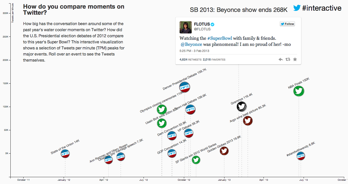
Some of the examples I’ve shown are interactives that complement a story. For example I presented about Twitter’s biggest moments
and also about our last Emmys visualization.
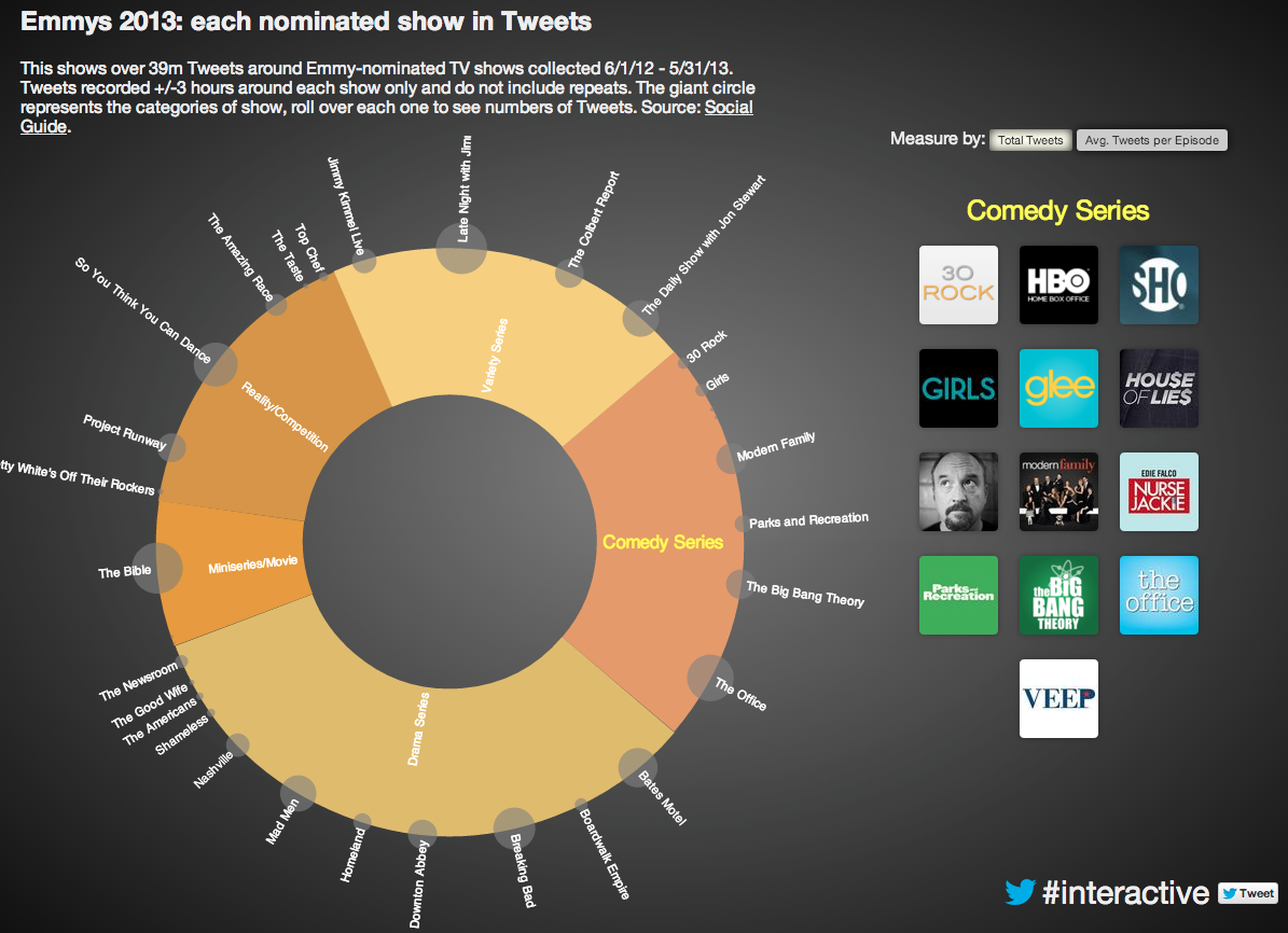
In the presentation I explained that these projects are generally done within the week (sometimes even in less time). The ratio of time invested vs. amount of engagement is high, so it’s a strategy that currently works for us.
Laika
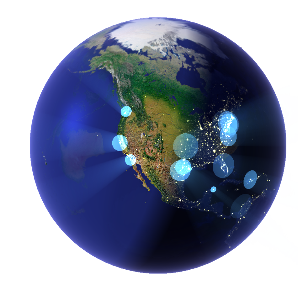
Laika is a data visualization showing geolocated activity on Twitter around the world. The first iteration of the project was done during hackweek. We had great feedback from people in the office so per request the project turned into a live visual that is currently shown in the displays around the Twitter HQs.
The main view shows a globe view, with day and night textures, displaying geolocated Tweets and relevant Tweets around news (in the top part). Click play to watch the short video.
Within this globe view we can focus on a particular city and fetch a timeline of relevant Tweets happening there. Click below to watch the short transition.
Although people like the globe view, this view hides 50% of what’s happening in the world at each moment. We added an unfolding of the globe into a plane for this. Click play below to watch the short video.
Following the “Overview, zoom and filter” mantra you can focus in a city to get relevant Tweets of what’s happening there along with news of that city.