


Mobility Flow of France
Click here to access the map (A WebGL capable browser and computer is required).
A few months ago I spoke at Strata in Santa Clara, CA. My presentation was about Exploring Web Standards for Data Visualization and in the presentation I showed some examples of visualizations done at Twitter with HTML/SVG, 2d Canvas and WebGL.
I also showed a custom visualization of the mobility flow in France (i.e. how people moved from state to state in the past five years) and an attempt at visualizing this pretty rich dataset (> 45,000 entries) with different standards. You can find the result of the visualization here. Please make sure you have a WebGL capable browser (and machine) to view it.
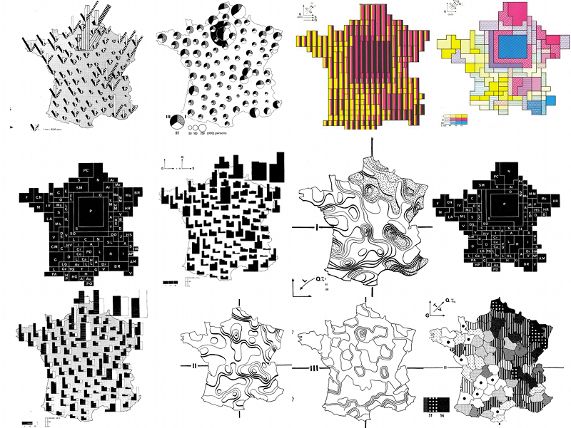
Although this is a pretty classical map, the work was inpired by Jacques Bertin’s Semiology of Graphics. Since he was a french cartographer his book is filled with maps and cartograms of France for different datasets.
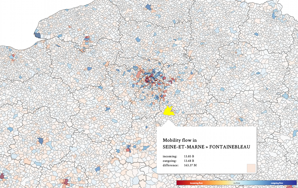
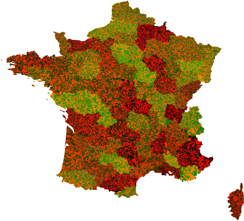
The visualization has two types of maps. The first one is an aggregated map by state and county, where states are reddish if the overall state population increased in the past five years, and a more blueish color if the population decreased. Clicking on a state will show this information at a county level.
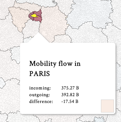
The other map shows mobility flow for a selected state. It gets triggered when a state is hovered more than 2 seconds. In that map reddish states are the ones getting people from the current hovered state and blueish states are states where people moved to the hovered state.
Following the second map there are some interesting insights. For example, if you hover on Paris you’ll note that most people move from the city centre to the suburbs.
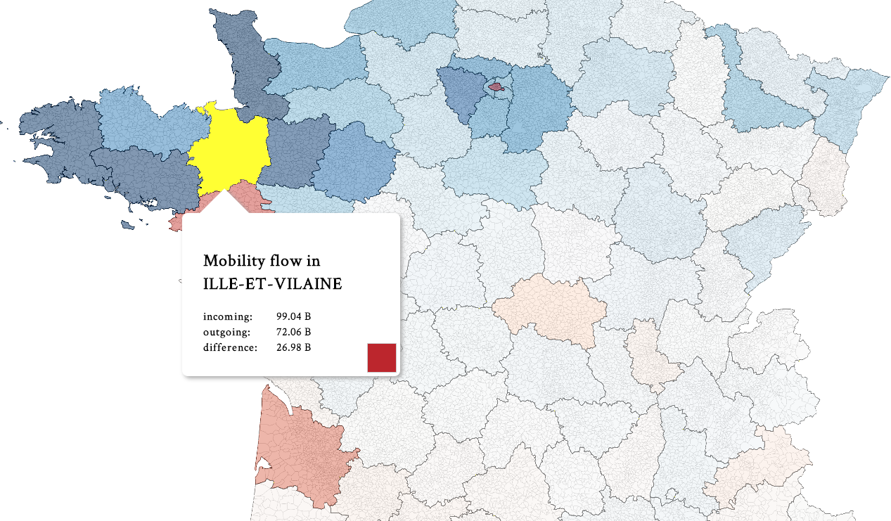
If you hover the suburbs, you’ll see people going even further away from Paris. If you follow this pattern you’ll find that a lot of people are moving from Paris to Bretagne:
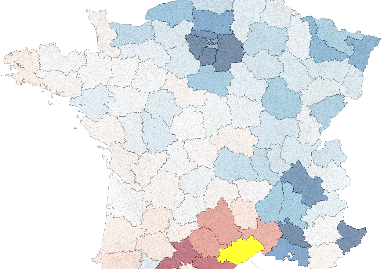
Another interesting fact is that if you hover some state in the south of France you’ll see a lot of people from everywhere else going there, except for Paris: in that case there are lots of people going from the south of France to Paris.
There are other interesting patterns too. I think this does a better job than the US mobility map. The US map does not show information when there’s no interaction, and when there is the edges added to the viz occlude the actual color of the states and things become hard to read.
Standards Used
One of the challenges for the visualization was to display data at the county level:
I first tried to just simply load the SVG county map of France, but this just took too long:
I know it looks like a neat animation, but this is actually the result of loading the county svg map (without caching) in chrome. It takes more than 30 seconds to load!
Instead I tried a layered approach, in which different layers for maps of France where loaded. One for the contours, another for the data itself and a last one for the picking / interactions.
For picking we used a map in which each state has a different color, same for the counties.
When a user hovers a state or county, we can retrieve the color of the pixel under the cursor in the picking maps, and so we get an id for the state to retrieve information from. I explained this technique of color picking before in examples like the wind map and the flight patterns visualization.
The result is a smooth interactive visualization that fully uses the GPU to render.