


Behind the scenes: Visualizing the conversation around the #WorldCup
Yesterday we released an article showing Twitter data about the global conversation around the World Cup. The main piece consisted on a data visualization showing how each country mentioned the national teams.
This is a behind the scenes on this work. I will show how we got to design the visualizations and interactions we came up with for the project and also I’ll cover some interesting insights taken from the data visualization.
So first things first, if you haven’t yet please go on, have a look!
The visualization has two main parts. The top one lets you select a country that participated in the World Cup and for that country one can see things such as:
- What were the top countries mentioning the selected country, also called mentions of
- What other countries were mentioned by the selected country, also called mentions by
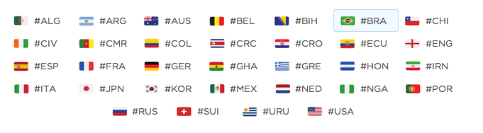
This was done by analyzing hashflag mentions in Tweets.
We went through a few iterations for the top visualization:
First iteration
The first take we had on it merged both the menu and the graph in one single graphic:
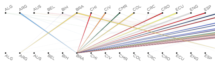
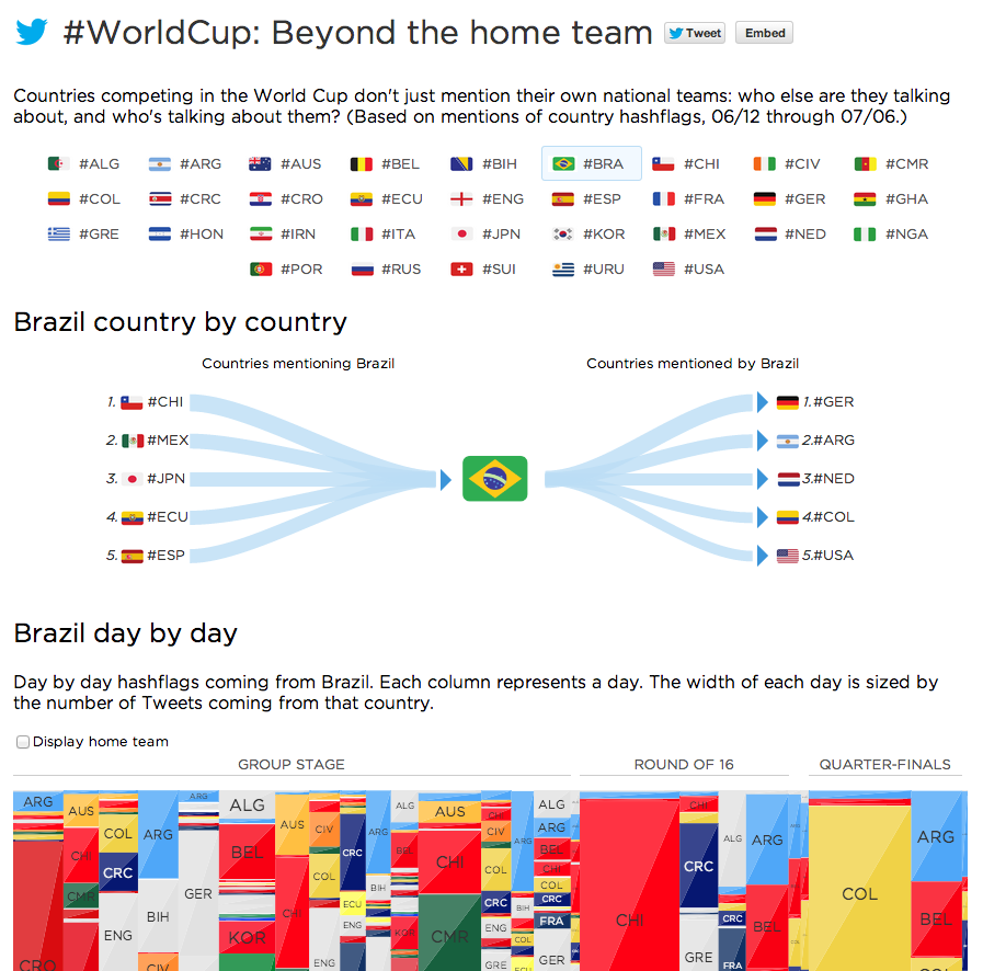
The above row shows “mentions by”. The bottom row shows “mentions of”. The above image shows the results for Brazil. This image shows for example that people in Brazil also mention Argentina and Germany (cropped). It also shows that most of the other countries in the World Cup mention Brazil constantly.
To enforce the notion of directionality we implemented the tapered representation recommended in Holten and van Wijk paper.
However, after some user testing we found out that although the visualization combined both the menu interaction and the mentions data in a compact way, it was confusing for people. The directionality was not clear and also it wasn’t clear that the labels were also used as controls to select a country.
Second iteration
The second iteration then focused on simplifying the graph. The simplest encoding we came up with to represent the information were two sets of bar charts, one showing a list of top countries mentioning the selected country or mentions of; and another bar chart mentioning the list of top hashflags mentioned by the selected country or mentions by:
These two bar charts convey almost the same information than the first design. The main differences are that we only select the top 4 countries on each side of the list, and also that we decide to add percentages to show how often mentions of and mentions by happened.
This design also forced us to separate the interaction part from the visualization. We created a separate menu listing all hashflags:
Paradoxically we found that this design was in a way worse: although it looked simple, it now consisted of two disconnected parts and it was hard to visualize the flow of mentions by/of.
Third iteration
After more user testing and gathering feedback from our team we came up with the third design. This one still focused on “low entropy” but also included the notion of directionality we had on the first design. It shows almost the same information than the first one, but needed less text and less explanation time to be understood by our test users.
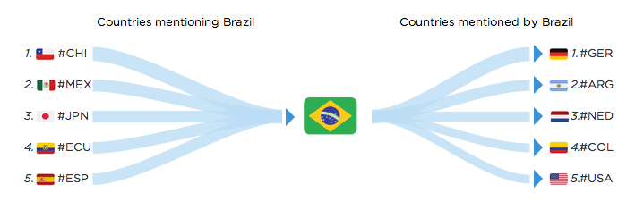
A few interesting insights emerge from this visualization:
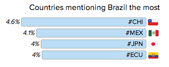
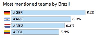
For Brazil, its team was widely discussed among football fans in Chile and Mexico, while Brazilians were paying a lot of attention to semifinal opponent Germany, archrivals Argentina, and fellow semifinalists Netherlands:
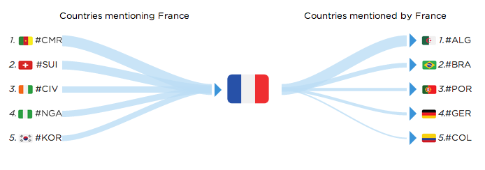
For France it’s interesting to see some of the immigration patterns. The most mentioned hashflag from France is #ALG. Top countries mentioning #FRA are french speaking countries and ex-colonies:
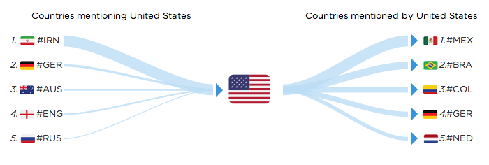
For the US the most mentioned hashflag is #MEX (for Mexico).
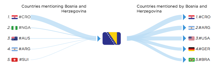
Some other connections can be geographical, like Bosnia and Herzegovina and Croatia mentioning each other:
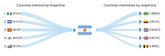
For Argentina, it’s interesting to see that besides Brazil the main mentioned country is Colombia. The Argentine coach Pekerman was the coach for the Colombian team this year.
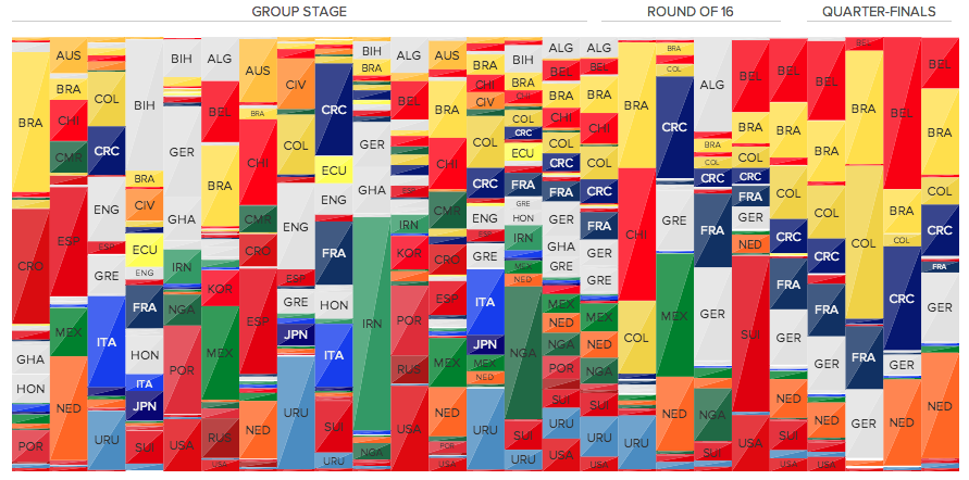
Bottom visualization
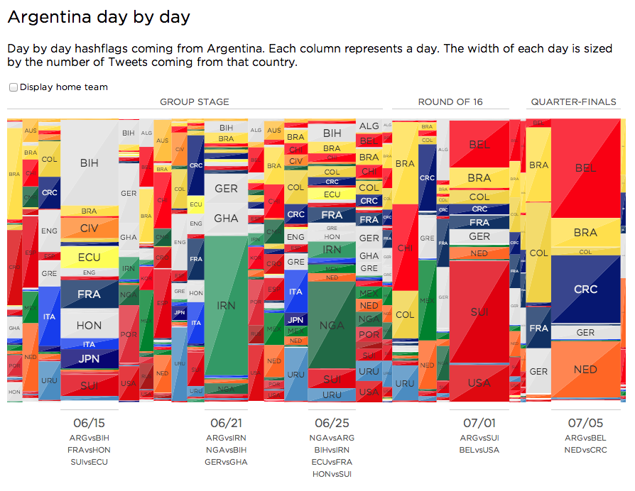
The bottom visualization was actually the first visualization we worked on. It is mostly an exploratory visualization and shows with finer detail all the hashflag mentions for the selected country day by day.
The viz is a bit harder to read, but there is a rationale behind the design choices for it.
Each column represents a day, and the width of each column is sized according to the volume of Tweets with hashflags sent from that country on the given day. Inside each column we have the relative distribution of hashflag mentions during that day. Here’s an example for Argentina:
The most challenging feature to grasp might be the width encoding for each day. Why not just create a stacked bar chart and use the (cumulative) height of each bar to represent the amount of Tweets for each day? This would be the result for Argentina:
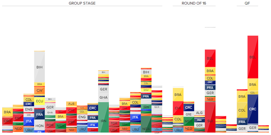
As you can see (or not see), some days are readable, but most of them aren’t. This happens because we’re encoding two things with height: the number of Tweets for each hashflag on a given day and the cumulative number of Tweets on a given day. Yes one adds up to the other, but these are different metrics and can be encoded differently.
To get our visualization the first step is to get rid of the height encoding for the Tweets per day value. We now have a percentage based area chart:
Second step is to encode total Tweets per day on the x-axis.
This is not a novel design: you can find this in slice and dice treemaps. As opposed to squarified treemaps, the slice and dice treemap algorithm maintains order and stability for nodes, but its nodes usually suffer from having high aspect ratio. You can explore squarified, slice and dice and strip treemap layout algorithms in this implementation I made with the JavaScript InfoVis Toolkit a long time ago.
The treemap layout also has some interactions. By clicking on a day one can zoom in and see the relative mentions for each hashflag with more detail:
All in all it proved to be a nice exploratory tool to infer some of the findings I mentioned for the top visualization.
Conclusion
Data visualization is an iterative process. Moreover, you cannot do data visualization by yourself and expect it to be optimal. Do not underestimate user testing and most of all, don’t underestimate peer feedback. With that I’d like to thank the communications and analytics team at Twitter for their feedback and testing of the visualization.