
Hi! I'm Nicolas and I'm interested in information visualization, JavaScript and web standards.
I currently work as a Data Visualization Scientist at Twitter. I wrote PhiloGL, the JavaScript InfoVis Toolkit and V8-GL.


JavaScript InfoVis Toolkit Customizations
Posted in:
javascript infovis toolkit
I had the chance to play with the JavaScript InfoVis Toolkit lately. It's nice to be able to use the Toolkit instead of developing it. The main reason I built the Toolkit in the first place was to create specific visualizations I was needing for MusicTrails. At the end I got to code lots of features but didn't have the chance to play with them for a long time.
I hope these examples can demonstrate that the Toolkit was really built upon the concepts of Modularity, Extensibility and Composability.
Stacked Bar Charts
One of the things I wanted to do for some time now was to adapt the Spacetree visualization to show Bar Charts. By watching this example we can already tell that the Spacetree can be used to represent something similar to a Bar Chart. For the next example I created a BarChart class that uses a Spacetree with some special node rendering function to plot bars for each node: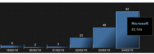 What's also interesting about this widget is that the custom node implementation I made allows it to show stacked values:
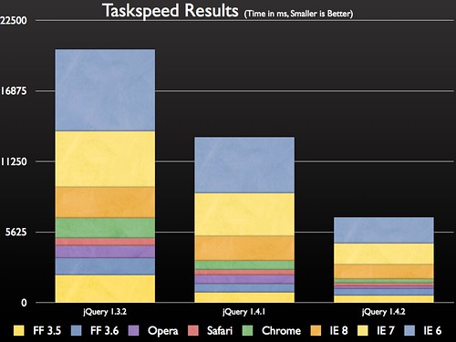
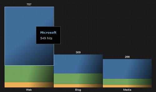 Stacked Bar Charts are useful when aggregated results are as meaninful information as knowing the specific value of each analyzed element. The JQuery team used these kind of charts for measuring performance in different browsers for different versions of JQuery. As you can a see in the next picture, the overall performance comparison is as useful as the specific browser performance improvements data.
 Implementation
In order to make Stacked Bar Charts I stored multivalued information into the nodes' data property and then accessed it to render each node like this:
Implementation
In order to make Stacked Bar Charts I stored multivalued information into the nodes' data property and then accessed it to render each node like this:
//Here we implement custom node rendering types for the ST
ST.Plot.NodeTypes.implement({
  'stacked': function(node, canvas) {
    var pos = node.pos.getc(true), nconfig = this.node, data = node.data;
    var cond = nconfig.overridable && data;
    var width  = cond && data.$width || nconfig.width;
    var height = cond && data.$height || nconfig.height;
    var algnPos = this.getAlignedPos(pos, width, height);
    var valueArray = data.valueArray;

    var ctx = canvas.getCtx();
    ctx.save();
    if(valueArray) {
     for(var i=0, l=valueArray.length, acum=0; i<l; i++) {
      var rgb = valueArray[i].color.hexToRgb(true);
      var rgbdark = rgb.map(function(e) { return (e * .3) >> 0; });

      var lgradient = ctx.createLinearGradient(algnPos.x, algnPos.y + acum,
        algnPos.x + width -1, algnPos.y + acum + (valueArray[i].hvalue || 0));

      lgradient.addColorStop(0, rgb.rgbToHex());
      lgradient.addColorStop(0.5, rgb.rgbToHex());
      lgradient.addColorStop(1, rgbdark.rgbToHex());

      ctx.fillStyle = lgradient;
      ctx.fillRect(algnPos.x, algnPos.y + acum, width, valueArray[i].hvalue || 0);
    }
    ctx.restore();
  }
});Pie Charts + TreeMaps = Awesome TreeMaps
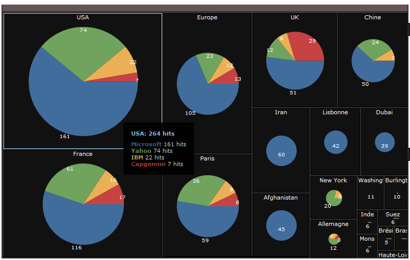
When lots of elements need to be compared the Stacked Bar Chart visualization can be confusing. This is due to the fact that each bar gets thinner and the aspect ratio for each bar tends to be very high. I wrote about the aspect ratio problem some time ago, and I also showed that it could be solved by using Squarified TreeMaps to show hierarchical structures in constrained space. This is OK for replacing Bar Charts, but what about Stacked Bar Charts? Should we subdivide each TreeMap cell into the number of stacked elements? I didn't find that solution very appealing: for each TreeMap node its subnodes would have the same color, same name, but different values. It seems like redundant information. Instead, I opted to create Pie Charts inside each TreeMap node. Pie Charts are useful to compare values where the whole information also has a meaning. Here's an example I did with the same data collected from the second Stacked Bar Chart image (click on the image to enlarge):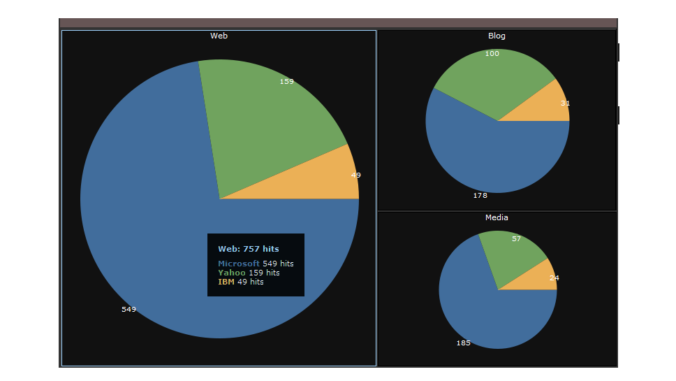 Each TreeMap cell is proportional to the amount of aggregate information for each element. The Pie Chart compares the specific information of each element.
While the previous example isn't too useful, this next example collects more data and thus makes this visualization more suitable (also click to enlarge):
Each TreeMap cell is proportional to the amount of aggregate information for each element. The Pie Chart compares the specific information of each element.
While the previous example isn't too useful, this next example collects more data and thus makes this visualization more suitable (also click to enlarge):
 Implementation
By taking a look at this example we can see that we can make Pie Charts by using RGraphs and adding a special node rendering function. We also know that we can make Squarified TreeMaps by looking at this example.
So how can we combine these two visualizations?
The TreeMap visualization accepts a controller method that is triggered on element creation. This means that for each created treemap node a callback is used that can post-process each TreeMap node. This method is called onCreateElement and I use it to append a pie chart for each TreeMap element like this:
Implementation
By taking a look at this example we can see that we can make Pie Charts by using RGraphs and adding a special node rendering function. We also know that we can make Squarified TreeMaps by looking at this example.
So how can we combine these two visualizations?
The TreeMap visualization accepts a controller method that is triggered on element creation. This means that for each created treemap node a callback is used that can post-process each TreeMap node. This method is called onCreateElement and I use it to append a pie chart for each TreeMap element like this:
onCreateElement: function(content, node, isLeaf, leaf) {
  if(isLeaf && node.data.valueArray) {
    var w = leaf.offsetWidth, h = leaf.offsetHeight;
    //create a canvas with unique id
    //and append it to the leaf TreeMap element
    var c = new Canvas("piechartcanvas_" + TMPieWidget.count++, {
      injectInto: leaf,
      width: w,
      height: h - 2*tm.config.titleHeight
    });
    //create a RGraph with nodepie node rendering
    //function
    var rg = new RGraph(c, {
        Node: {
            'overridable': true,
             'type': 'nodepie'
        },
        Edge: {
            'overridable': true
        },
        //Parent-children distance
        levelDistance: ((w > h? h : w) / 2) - 2*tm.config.titleHeight,

        //Add styles to node labels on label creation
        onCreateLabel: function(domElement, node){
            domElement.innerHTML = '';//node.name;
            if(node.data.$aw)
                domElement.innerHTML += " " + node.data.$aw;
            var style = domElement.style;
            style.fontSize = "0.8em";
            style.color = "#fff";
        },
        //Add some offset to the labels when placed.
        onPlaceLabel: function(domElement, node){
            var r = rg.graph.getNode(rg.root);
            var style = domElement.style;
            var dw = domElement.offsetWidth;
            if(r.data.count == 1) {
              var dh = domElement.offsetHeight;
              style.left = (w/2 - dw / 2) + 'px';
              style.top = (h/2 - dh) + 'px';
            } else {
              var left = parseInt(style.left);
              style.left = (left - dw / 2) + 'px';
            }
        }
    });
    rg.loadJSON(that.createJSONPie(node));
    rg.refresh();
  }
}