Firefox 4 Beta User Interface Study
We present a visualization study of the interactions users have with Firefox 4 Beta UI components. This study provides an insight on how accessible these components are. We try to answer questions like: How frequently are these components being accessed? What are the main UI interaction differences between experienced and non-experienced Firefox users? How UI interactions change for people accessing Firefox from their Homes, Work, School or Mobile devices?
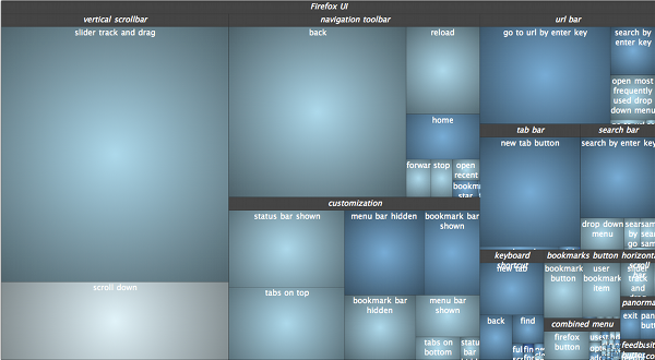
The main visualization is based on a Squarified TreeMap layout where each rectangle represents a UI component. The area of each rectangle is proportional to the number of times a UI component has been accessed; the color of each rectangle varies from red (beginners) to blue (advanced/power users).

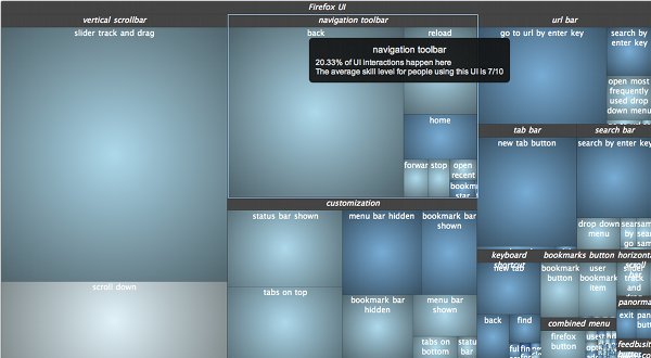
Hovering each rectangle of the TreeMap shows a tooltip with information about how frequently accessed that component is and also about the average skill level of the users accessing it.

Left clicking on a rectangle sets the focus on that UI component group, right clicking on the visualization brings the user back to the previous level of the hierarchy.
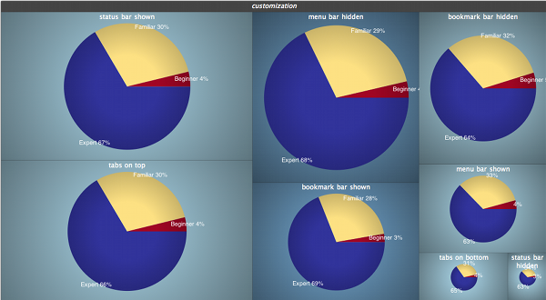
We understand that making an average of the users' skills, although interesting for an overview, can lead to incorrect results. We solve this problem by adding a pie chart visualization that shows how users skills are distributed for a UI component.

We also provide dynamic filtering based on different criteria such as the user experience with using Firefox, the user location when browsing the Web and whether the user browses the Web with other browsers besides Firefox. This dynamic filtering provides insights on how to make Firefox more accessible to different types of users. Also, the smooth animations provide an easy way to compare the main usage differences across categories of users. You can trigger these filters by clicking on the top buttons.
