


Our entry for Google's Data Visualization Challenge
Launch the Visualization by clicking here! (browsers supported are the latest of Google Chrome, Firefox, Opera and Safari -not IE).
Luz Caballero and I have been working together for a couple of weeks to create an interesting visualization for Google’s Data Visualization Challenge.
Every year, Americans fill out income tax forms and make a payment to the IRS. Where does it all go? Using data provided by WhatWePayFor.com, we created a data visualization that will make it easier to understand how the government spends our tax money.
The Visualization
We want to help people grasp what these millions and billions mean… 43.03M on Federal aid to highways… is that too much or too little? The Federal Budget is traditionally divided in 20 “functions” that, under names like “National Defense” or “Energy,” show the purposes to which money is allocated. Our goal is to show not only how much money is spent for each function on a given year, but also
- How does that compare to other functions? What are our priorities? Would cutting this give us money enough to fund that?
- How has the amount spent on each function changed over the years? Hopefully this should give us all an idea on what has traditionally been considered normal highway spending ;)
- Where does the money allocated to each function finally go? (Because we would never have guessed that we would find a USD 150M bailout under “Other advancement of commerce”!)
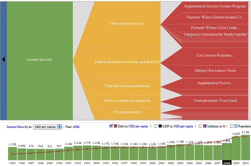
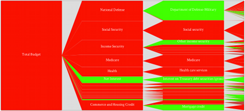
This visualization is made of two components. First, a tree layout shows, for each given year, how the budget (blue) is divided on each function (green), subfunction (yellow), and “account” (the most granular subdivision accounted for in the budget, which gives an idea of the use to which the money is put) (red):
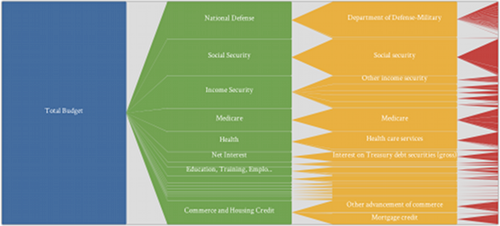
The hegiht of each node/section in the tree is proportional to the amount of the budget spent on that function, subfunction or “account”. You can click on the nodes to navigate and filter functions and subfunctions. To go back you can right-click or click in the back arrow on the left of the visualization.
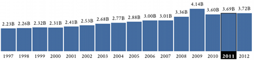
The second component of the application is a timeline that puts the amounts you are visualizing in the tree in a temporal context, showing the evolution of that particular spending category through time. Click on the bars representing the different years to navigate through time.
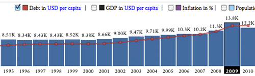
We wanted to allow our users to compare today’s spending to the 80s’ without artifacts caused by inflation, and changes in population and GDP. This is why our visualization shows inflation-adjusted USD, gives you the the option to see spending in USD, in USD per capita, or as a percentage of the time’s GDP. Plus, we wanted to give our users a good shot at pinpointing if/when spending changes are a consequence of government policy or of the economic climate. This is why you can overlay indicators like debt, GDP, inflation and yr/yr population change, to give you an idea of how they affect and are influenced by spending trends.
Interaction
What makes this application most interesting is the interaction between the components, which are tightly coupled.
When a function is selected, the timeline will adapt to show the budget spending trend for that particular function over the years.
When clicking on a timeline element, the tree will animate to show how the budget is spent on each function, subfunction and account, for the selected year.
If you are interested in comparing how the budget changed between two different moments in time, there is an option to transition between years using colors, red and green, to highlight a decrease or increase of total budget spending for each item.
Demo Video
We created a video that shows how to navigate and filter data and some interesting finds we made using our visualization. Click here to see the video in HD.
Acknowledgements
We would like to thank the people who gave us feedback on this visualization and helped us to improve it. Thanks for your help!
Click here to access the visualization!